
Balancing the picture
‘Delight lies somewhere between order and chaos…’ (I forgot who it was that said that)
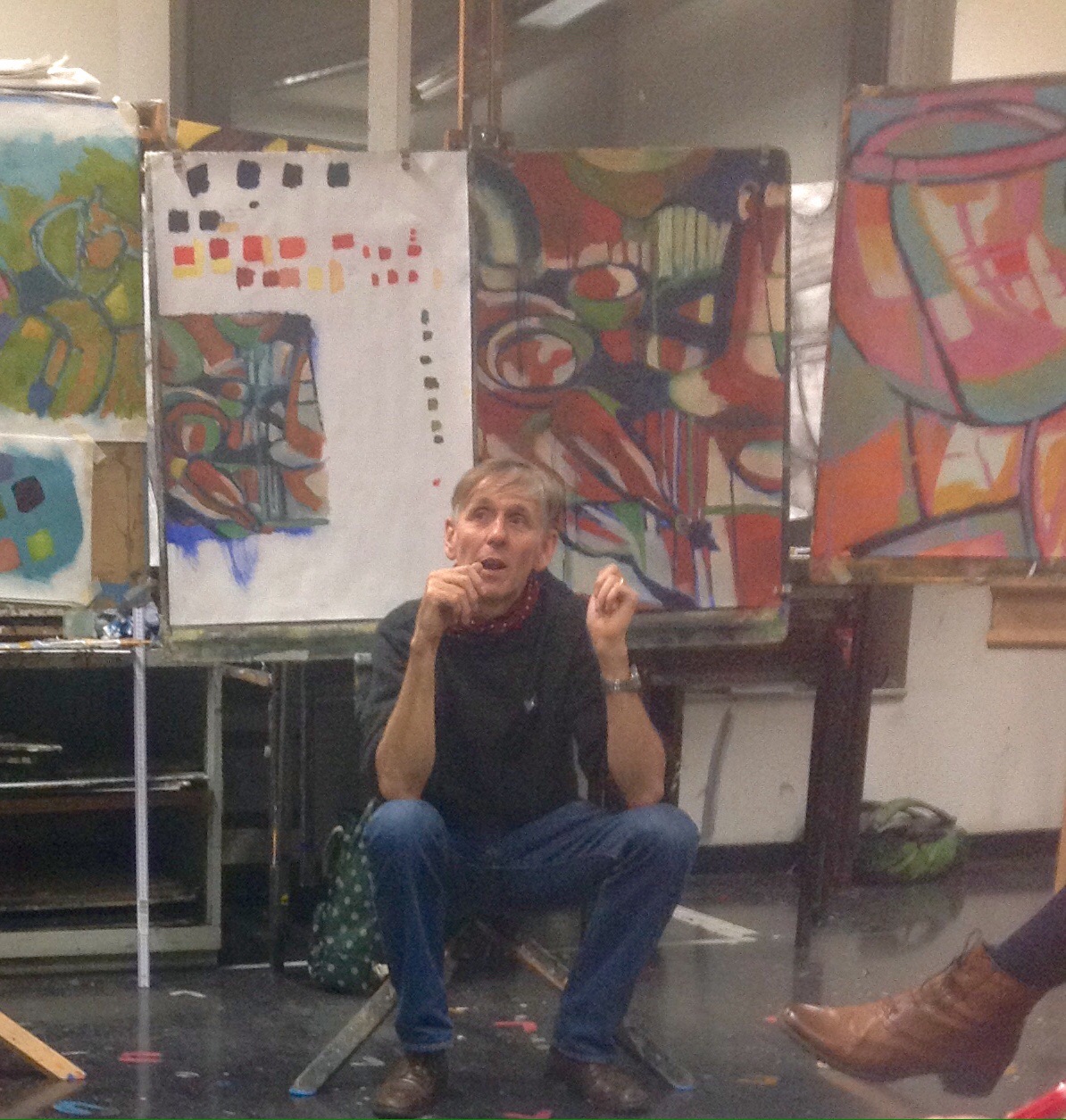
This week was all about developing colour in our picture – last time we’d chosen 3 colours to create dark, medium and light parts of our painting. Chris spent a time showing us some paintings by Whistler, Sickert and some movie stills from Paris, Texas (Wim Wenders) – talking about ways colour was used both in terms of the determining the whole mood of the painting (as in the Whistler Nocturne) or by providing a resolution in terms of a point of colour eg the orange paint on the Sickert shop front, the red glass in the Paris Texas still.
Chris talked about needing to decide what game you are playing in order to develop the colour – contrasting or extending the colour, hot and cool colours, complementary colours, what kind of emotional experience do you want to share with others. Quite difficult to take on those ideas at the time but on reflection they make sense as I try to write.
Today’s task
Today’s task therefore was to introduce more colour – going slowly and making conscious decisions, and interpreting marks and textures from our drawings ‘to complicate the painting’ (Chris).
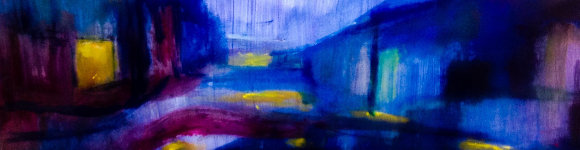
I started out by adding pink over a lot of the grey background colour which I’d decided was very flat last week. I also added green over some of the orange which really dominated the painting from last week to add contrast and texture over the orange. I then decided to go for yellow to balance my picture – but ended with a horrible whitey lemon distemper colour which reminded me of the freezing cold bathroom at my nan’s house in Worsborough Common. I didn’t like going in because I thought a fox lived in there.
I quickly got rid of most of it by adding a pale greeny blue which I really like. I also added a few flashes of golden yellow light on the objects.


")
")
")
")
Putting in the lines from the drawing certainly helped the texture of the painting a lot – and I felt more confident about this part – though I found it hard to decide what colour the lines should be – I used dark blue to start with but also some lighter lines and increasingly crimson red lines. I used a ruler – drawing the brush along very quickly (suggested by Chris) so the line wasn’t solid. I also, on Chris’s suggestion firmed up the lines ariound the objects which really helped I think.
Finally…
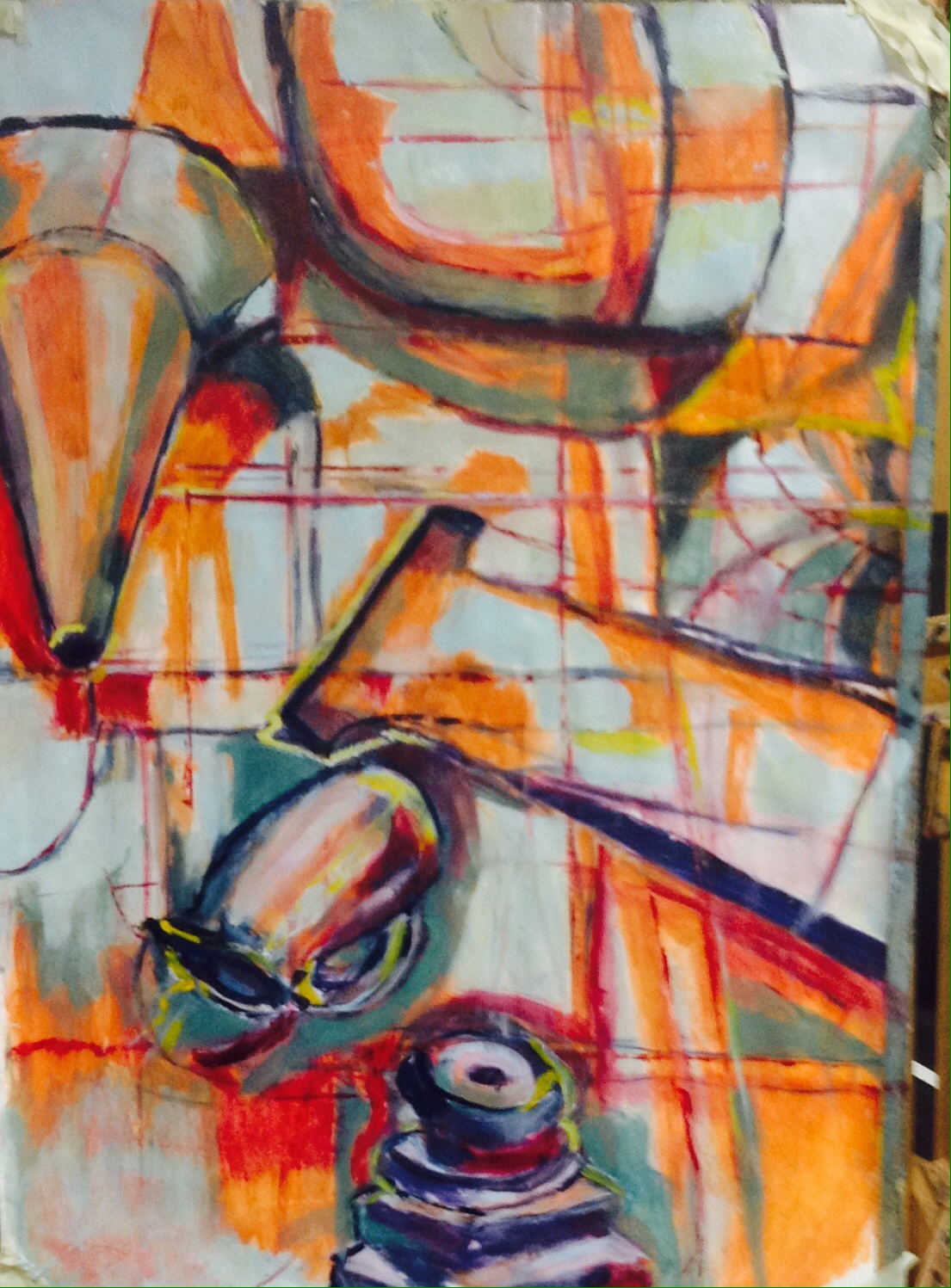
I was fairly pleased with my painting – I often don’t feel that about my work – I don’t feel it was really finished – particularly the bottom left corner- but as it’s dried it really does look quite vibrant and lively.
I felt I’ve learned a lot from the whole process – at certain points I kept remembering Tony saying with the drawing – which parts are working, which parts need attention – and trying to do the same with the painting. The discussion about colour was really helpful and part of a long process – some main points being – to go slowly, to try things out and to think why you’re choosing, to trust also to instinct, surprise, to reevaluate, to think about your audience.